Wednesday, May 30, 2012


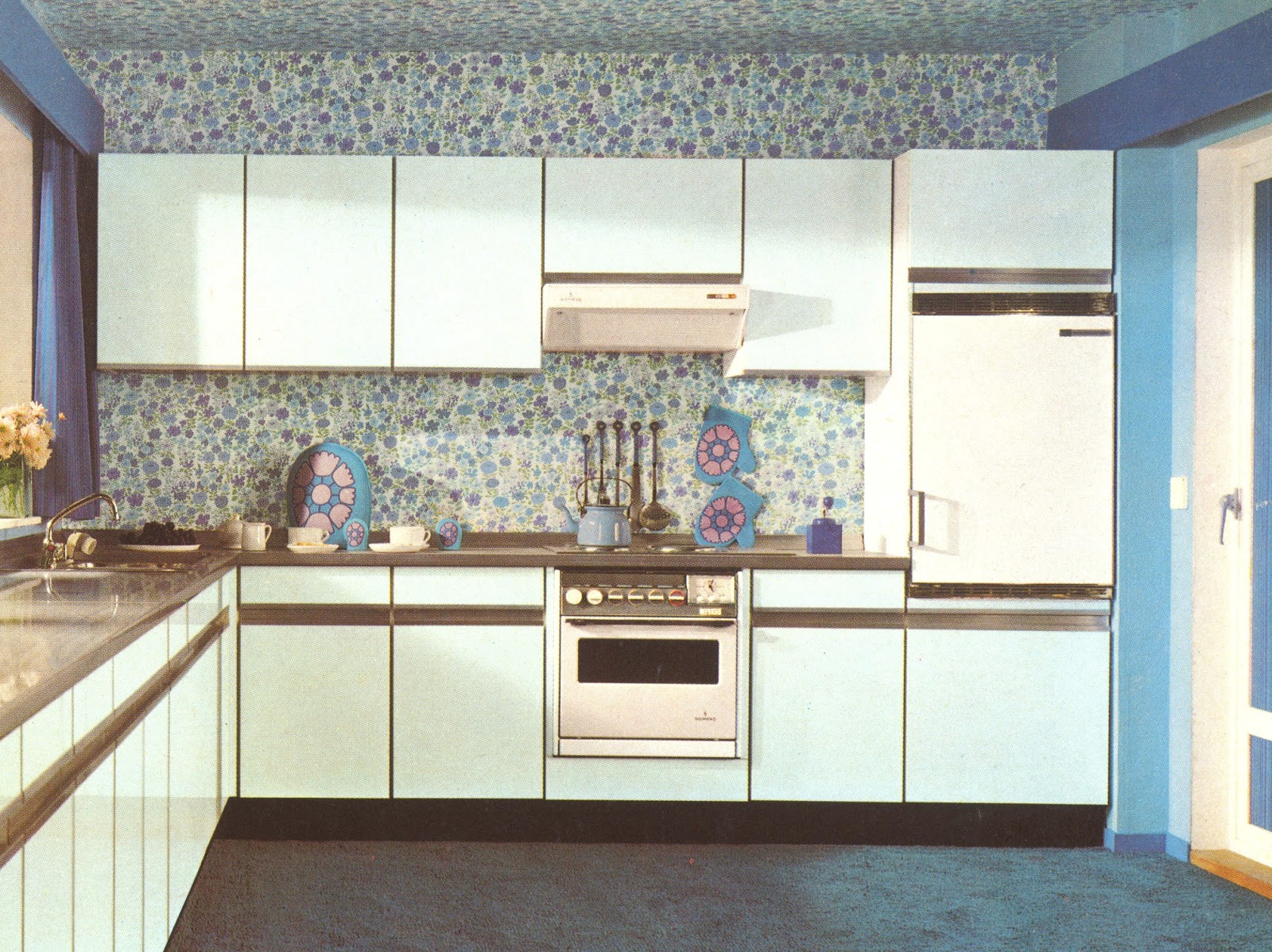
Contemporary kitchens

Contemporary (today) period is known as post-modernism, and because there is no agreed mainstream style, opinions about what is contemporary and what is not are very diverse. Hence, you will see revivals of classic styles with a modern twist, sculptural statements like Steininger design kitchens , or futuristic/spaceship-like kitchen of Zaha Hadid . One word is common for contemporary design – out of ordinary, individual, and unique.

Most commonly contemporary kitchens offer clean lines and generous surfaces with an uncluttered feel. Some customers find that contemporary cabinets don’t create a warm and welcoming kitchen; hence, they ask for a sort of mélange of style for a softer look. This can be achieved by alternating the large, uncluttered surfaces with wood grain panels or shelves or combining styles, the newest addition being baroque elements.

When it comes to choosing the right material for contemporary kitchen cabinets, the possibilities are endless. Anyway, the most common finishes, at least in Australia and New Zealand, are two-pack painted surfaces, wood veneer or solid timber, smart laminate, stainless steel, and glass. Wood textures look great in simple designs; it brings a natural feel to the room, whether in light or dark finish. Dramatic grain can be a real design element here. Drawer pulls and door knobs are often absent, but when they are used, they are carefully chosen for the right effect. Metal handles are especially popular, often in brushed finishes and long, narrow shapes (Henderson, n.d.).


If we so far saw modularity and repetition in designing a kitchen, in this example, the whole is created using a play of proportional scales. You can intuitively feel the use of golden proportion along with Fibonacci sequence of numbers. The expression is subtle, complex, and rich in textures, out of ordinary. This kitchen raises itself at the level of ambient sculpture. Photo courtesy: Steininger Designers, Vienna.
Fragment from the book: "Kitchen Designer-Your Dream Job" by Valentin Tinc

Tuesday, May 29, 2012


Modern kitchens 


People use this word in so many ways, you will be surprised. Often this term is used as opposite of ‘traditional,’ and the word of this style is form-follows-function, a phrase dear to the modernist movement founders of Bauhaus. 

Modern kitchens are open and airy with a very efficient-working triangle and good workflow. Freestanding appliances are replaced with built-ins to blend with the sleek, new streamlined cabinetry. The space is filled with highly efficient cabinets and updated hardware. As a rule of thumb in designing a modern kitchen, you will be looking for cabinets of similar width, symmetry, and a strong sense of organisation. Kitchen islands are a big asset to the modern kitchen; they open up the space and provide an eating area, extra storage, additional counter space for food prep, and socializing. 

Modern countertops are simple and uncluttered. Common materials include stainless steel, concrete slab, quartz, glass, and granite. If the traditional countertop profile includes bull nose or double pencil, modern tops have straight edge in 20 mm, 40 mm, 60 mm, or 100 mm thick. Splashbacks are either large sheets of glass, stainless steel, or stone – easy to clean, sleek look, perfectly integrated in the whole composition.


This is a sleek state-of-the-art kitchen with well-designed cabinetry and a harmonious flow of lines. Simple shapes with uniform sizes, well organized and elegant, functional and efficient. Photo courtesy: Urban Kitchens, Melbourne.

The most used finishes in modern cabinetry include two-pack finish in gloss or satin, stainless steel, and veneer or laminate. The cabinetry is well-designed, with a harmonious flow of lines that are simple, uniform, organized, and elegant. A modern style connoisseur will be after a functional, efficient, sleek and state-of-the-art kitchen (Sachs, n.d.). 
Fragment from the book: "Kitchen Designer-Your Dream Job" by Valentin Tinc 


Sunday, May 27, 2012


French or British Country Kitchen Design

The French and British country kitchen design is rich with beauty and rustic old-world charm (Wisch, n.d.).They offer an unprecedented coziness and warmth that makes these styles sought after even today in a large number. Designing country kitchens means working with a set of elements that cannot be changed but adapted to new space and configurations. Once you’ve got the basics down, you’ll be able to create the look and atmosphere of a true country kitchen. Elements to take in consideration are the following:

French and British cabinets feature plenty of detailing, dentil cornices and proud skirting boards, flutes, pilasters, and corbels. Some kitchens are more ornate than others, depending on the company and the client’s requirements. The wood or paint is often distressed, giving it a weathered look. You’ll commonly find some overhead cupboards left open for displaying plateware and a combination of wood or glass cabinet doors throughout. Handles are porcelain, wooden, or wrought iron knobs. Most large kitchen manufacturing companies will have those styles in their collection in a more or less elaborated degree. Small companies tend to avoid country styles, due to a high level of craftsmanship required, manual work involved, and the complexity of detailing.


This country kitchen features plenty of detailing: bolection moulding for doors and drawer front, large top moulding, proud skirting boards around the island, fluted columns with bullseye in front of the island, and large mantle with corbels around stove. Classic handles, colonial bars, and tiled splashback. Photo courtesy: Farmers Doors, Western Australia.


As countertops timber, granite, and even polished, coloured concrete all look beautiful in country kitchens. Profiles for the tops vary from double half bull nose to Dupont bull nose or ogee bull-nose offset.

Kitchen islands are usually more ornate than the rest of the kitchen with fluted columns and corbels in the corners and can feature a different counter surface such as dark wood. Sometimes, the island houses a large butler porcelain sink (farmhouse sink).

The backsplash behind the oven can be simple or ornate and tiles look best, especially if slightly irregular for a handmade appearance. Earth tones give the kitchen a more rustic look.

Cabinet’s colour scheme is based around off-whites in hues of yellow from buttery cream to golden sunflower or hues of green from olive or sage to deep fir green and pale to medium blues in the distressed style. Probably, these styles are the only ones that can take a blue colour in the scheme. For a real old-world glow, look for warm yellow, creamy white, soft grey, and earthy terracotta, or you can colour-wash and glaze multiple mellow earthy tones. 
Fragment from the book: "Kitchen Designer-Your Dream Job" by Valentin Tinc 


Wednesday, May 23, 2012


Classic or traditional kitchen

A traditional kitchen is a style that evokes comfort and familiarity with an emphasis on formality and derives from Victorian Windsor and Queen Anne style. Traditional kitchens feel timeless, are elegant, and are highly structured with a strong focus on symmetry and balance. Traditional features might include moulded solid wood door and panels stained or clear finishes, white painted paneled finishes, fluting, blocks, rosettes, trims, beading, arched and detailed paneled cabinet doors, and a mildly ornate moulding on top of cabinets (Mallory, n.d.).

Classic benchtops are marble or granite and bright brass hardware and fixtures. In most cases, the stone can have a contrasting colour with the cabinets such as white doors and black granite. Hence, when to specify a dark benchtop for a light cabinetry, make sure you don’t make involuntary reference to a traditional style. Benchtop edging-wise will be bull nose in full or half and Dupont with all its variations and ogees. Typical splashback are tiles, plain or ornate. 
Fragment from the book: "Kitchen Designer-Your Dream Job" by Valentin Tinc

Typical classical kitchen with white gloss cabinetry, central panel for doors and drawers, top moulding, contrasting stone with full bull nose, and tiled splashback. Photo courtesy: Smith and Smith Cabinet Makers, Melbourne.


Monday, May 21, 2012

A “feels good”, “works well” kitchen


A new kitchen is meant to re-enforce ones taste, validate personal achievements and status, and offer physiological comfort. Renovation of the kitchen is an occasion for reinforcing ones happiness. The kitchen as a place and design process is as complex as any other part of our life. Things should be kept simple, but in order to achieve simplicity, the designer has to work closely with the clients to unfold the complexity of their requirements, draw essential ideas and apply them creatively into a new design.

In the current family, Vicki’s passion for cooking and colour complemented the technical nature and attention to detail of Peter’s.  Working with them stretched my knowledge and abilities, as they expected the new kitchen to be at the highest level of quality, function  and design.
They were both tired of the old kitchen made of dark wood, small cabinets with a constrictive “U” shape, hidden somewhere at the back of the ground floor. Working in the old kitchen felt more of a punishment than anything else.  The kitchen lacked a useful bench-space, was cluttered, dark and too small for their large family.

                                             Image with the old kitchen of Vicki and Peter.


Vicki wanted to have a new kitchen that is light in colour, airy, that will become the centre of the newly renovated wing, open to the living room and dining room and able to accommodate their large family and friends. Hence, the oven and cook top were placed in the middle of the largest wall facing the living room and a step away, we created a massive island housing the sink and overhung on two sides.  The new design, with the central position of the island allows the cook to interact either with the family seating in the living room or with the guests from the newly built deck. Vicki’s passion for colour was expressed through a burned red colour (X Factor of Resene) for a large splash back stretch on the whole 4.8 metre wall. The red was, as expected, the peak of the colour scheme, otherwise composed of the reddish brown of the timber board, light buttery colour of the stone(Caesar stone-Buttermilk) and the soft Whispers White (of Dulux) high gloss of the cabinets.  


After a general layout and the final decision of the important features, it was Peter’s turn to complete the specifications with some fine touches and technical essentials: two undermounted bowls, a brushed aluminium kicker to bring a soft industrial look to the sleek cabinets, led lights under the bench for and excellent evening atmosphere and free of heat light source for people sitting on the bar stools, and low voltage halogens under and inside the wall units. Peter was aware of the importance of the kitchen investment and durability wise, thus he required up-to-date hardware of Hettich: soft closing steel drawers and V6+ runners (heavy duty), high steel walls for pot drawers, soft closing integrated hinges, Orga professional cutlery trays and anti slip mats, high quality folding doors Lazy Susan with chrome rail and melamine, pull out for spices, oils and vinegar.


With equal contribution from both clients, with their early involvement in the planning process, the end design was sure to achieve the perfect balance between “looking good”, “feeling good” and “a working well kitchen”.

Text and Kitchen design by Valentin Tinc
Photos by Tim Turner Photography
Kitchen by Smith and Smith Cabinet Makers, Melbourne


Friday, May 18, 2012

Colour schemes in the kitchen’s modern history -2000


The year 2000 brought a more subtle colour scheme with analogous harmonies and less tonal contrast. In the new millennium, the word for kitchen design and colour schemes was minimalist with subtle richness as oppose to colourful – in your face – bold look of the past. Customers were using their kitchens as a way to show social status but also to reinforce and relax. Painted and solid wood cabinets were now doubled with man-made stone and less natural ones, more steel, glass, and concrete in a variety of textures rather than colours. Behind an apparent simplicity of the surfaces, kitchens today are articulated structure, open and infinite composition, and combinations with a strong sculptural sign, which can be immediately perceived.  Fragment from the book: "Kitchen Designer-Your Dream Job" by Valentin Tinc
PRIMA LAB 2001 by Paolo Nava and Fabio Casiraghi for BINOVA is the result of in-depth study into the basic elements of modular kitchen systems. Each component competes to create a harmonious ensemble with an apparent simplicity yet articulated structure with a strong and rich symmetric layout. Photo courtesy: Paolo Nava Studio, Italy.

Thursday, May 17, 2012

Colour schemes in the kitchen’s modern history -1990


The 1990s kitchen retained Formica countertops, solid wood cabinets, and poor lighting. However, this decade did see the introduction of built-in stark white cabinets and white tables. Sleek and simple was the theme of the 1990s kitchen, which meant an increased interest in white-on-white, monochromatic looks. More appliances became available, and open-plan kitchens started to take off. The island was introduced to allow for a hostess/cook, and kitchens really became a social point for families. The 1990s were a decade of experimenting in uniqueness, and it seemed no two kitchens were the same. Kitchen and living rooms were open plan with a common colour scheme, blending in this way the kitchen activities into daily living (Louise 2011).  Fragment from the book: "Kitchen Designer-Your Dream Job" by Valentin Tinc
Photo courtesy Smith and Smith Cabinet Makers, Melbourne

Wednesday, May 16, 2012

Colour schemes in the kitchen’s modern history -1980


Nineteen eighties brought a strange blue into the picture, and I can’t say it was because of an overly creative spirit of the era or just plain confusion. Kitchens were starting to be viewed more as social rooms where friends and family could socialize; as a result, their size started to increase. Laminated, dark cabinets came into fashion as did various colour Formica countertops mimicking dark granite or marble. The psychedelic look from the 1970s was replaced with a more conservative ambiance, filled with solid woods in warm and cold hues. The layout of 1980’s kitchens was often poor because of lack of design experience, and lighting was often dim and dark. You may see, in older showrooms of today, dark grey laminate kitchens with even darker benchtops (Louise 2011).
Fragment from the book: "Kitchen Designer-Your Dream Job" by Valentin Tinc

Photo courtesy Smith and Smith Cabinet Makers, Melbourne

Monday, May 14, 2012

Colour schemes in the kitchen’s modern history -1970

Kitchens in the 1970s typically had an eat-at bar with decorative stools. When I meet clients with a kitchen built in 1970s, first thing they want to change is the raised breakfast bar. The walls were often painted or wallpapered in a bright sunshine yellow, and benchtops and tables were often covered in a coloured laminate such as burnt orange. This time period had kitchens filled with appliances and utensils in avocado green and brown and Formica tables with chrome legs and matching chairs. Many of these chairs are the delight of vintage hunters of today. Psychedelic-patterned wallpaper and colourful wall art rounded off the kitchen of the 1970s (Louise 2011). 
Fragment from the book: "Kitchen Designer-Your Dream Job" by Valentin Tinc


Although this kitchen is not filled with bright wallpapered in a sunshine yellow and burnt orange benchtops, it is typical for 1970 period. Note the combination laminate timber and no handle solution. Photo courtesy: Coordinated Kitchen and Bath, Vancouver.

Saturday, May 12, 2012


Colour schemes in the kitchen’s modern history -1960

Today kitchens are the centre of a home where people host parties and family gatherings. But this hasn’t always been the case. The idea of a kitchen didn’t become popular until the 1970s, and since then, kitchen decor has changed drastically. Each decade has brought about a different kitchen decor trend, and it doesn’t take much to figure out during which time period a kitchen was built.

You may meet clients talking about their first kitchen built in late 1950s or 1960s. They will remember pink combined with chrome, white, mint green or turquoise, vivid orange, and red. By the 1960s, colours became earthier with rich yellows, oranges, and browns, whilst sun yellow provided a brighter alternative. Sometimes, the splashback tiles had geometric patterns of polka dots, stripes, and checks. Steel cabinets, Formica counters, chrome accents, and copper vent hoods were all the rage for an up-to-date kitchen of the 1950s and 1960s. Timber and laminate, right through. 

Fragment from the book: "Kitchen Designer-Your Dream Job" by Valentin Tinc


Wednesday, May 9, 2012


A Hilton bathroom at home

Last year, Toby and Jodie extensively renovated the back of their terrace house. They created a new living and dining area, a new kitchen, new bathroom and powder room. The new addition is filled with light, has great flow indoor-outdoor and an eclectic warm look. After I designed the kitchen, I was asked to come up with some ideas for the new bathroom. Toby travels around the world and his brief was: “I want a Hilton bathroom at home”.
The design process went smooth, as both Jodie and Toby were open to new ideas. The first two versions of the bathroom were a soft minimalist style, with a modernistic composition of volumes, but version three was the one that made them both exclaim: “Wow, we didn’t expect that!” The third design proposition introduces a touch of baroque that contributes to the overall bathroom of “Feeling special”.
The new bathroom is well balanced, has a classy touch, a soft and rich feel and is airy and light. The feature wall with a baroque, velvety dark pattern on a silver background, creates a dramatic backdrop for the graphite suspended vanity unit, Venetian mirrors and complementary wall lighting. The pattern from the feature wall continues on to the other three walls, but on a white on white version: a delight for the eye keen on details.
The free standing bath creates a sense of luxury and freedom. Its pure oval shape, complements well on the bench basins, also ovals. A Large frameless shower with rain showerhead was Toby’s specific request so the bathroom feels like a subtropical retreat. Led rope lighting, surrounding the wall storage with mirror doors, contributes to a serene atmosphere during evenings.

Main bathroom, with its new baroque luxurious look, adds a soft gentle and rich touch to the overall home, composed around warm tones and subtle contrasts.

Bathroom Design by Valentin Tinc
Cabinetry by Smith and Smith Cabinet Makers, Melbourne
Photo by Tim Turner Photography
Words by Valentin Tinc


Monday, May 7, 2012


"If we so far saw modularity and repetition very often used in designing a kitchen, in this example, the whole is created using a play of proportional scales. You can intuitively feel the use of golden proportion along with Fibonacci sequence of numbers. The expression is subtle, complex, and rich in textures, out of ordinary. This kitchen raises itself at the level of ambient sculpture." Photo courtesy: Steininger Designers, Vienna.
Fragment from the book: "Kitchen Designer-Your Dream Job!" by Valentin Tinc

Thursday, May 3, 2012


Minimalism and techno-jazz
(the kitchen)


Minimalism is Dead! Or at least it’s not everybody’s cup of tea in  old and established areas of Melbourne, such is North Brunswick. Most clients wanting to acquire a new kitchen will steer away from the ‘chill of a too clinical style’ as Minimalism sounds like. Though there are some great lessons we can take away from minimalism, and this is exactly what J and T asked for when delivered the brief for their new kitchen: a blend between minimalism and a warm, cozy feel. They wanted the kitchen to look great, like examples they saw overseas and to suit family needs as well as friend’s gatherings.

The design proposition is based around some essential minimalist principles: it is strikingly simple, without being simplistic; spatial composition evolves around large calming, horizontal lines that are featured in the oversize bench; wall units alignment; the narrow glass splash back and the extended island. The idea of the generous horizontals is enhanced by a secondary group of elements: horizontal handles, brushed aluminium kicker, front island open shelve.


 Other minimalist principles employed here are: regularity of the rhythm, streamlined surfaces   and  consistency  in modularity.
In this kitchen, the wall units with no handles of identical size, create a repetition dear to minimalist savvy that is comparable to a techno beat. Aux contraire, the base units are based on alternation rather than repetition. If wall units have the strength in aesthetic, base units contribute to the whole outcome with their inherent functionality. Appliances are integrated into sculptural shapes, such are the oven, microwave and range hood or blended into the countertop surface such are the sink and the induction cook top. The flow is uninterrupted and effortless between centres!


Family and friends are incontestable values of our life and in J and T’s case, they become accountable design criteria. The Kitchen has to blend in with the family home, lifestyle and taste.
And from here comes the rich flavor added to the minimalist core: a touch of colour through the large glass surfaces, warm tones through the timber pattern of the base units, contrasting textures between the satin finish of the wall units and pantry and the glossiness of dark laminate.
Texture, colour, reflections and the play of surfaces, industrial lights, along with architectural enhancements such as the large, long window open toward the back garden, the flush bulkheads that integrate the kitchen into the body of the room are playful and warm jazzy like additions to the consistency of the minimalism beat.

Text and Kitchen design by Valentin Tinc
Photos by Tim Turner Photography

Melbourne, March 2012