Sunday, April 19, 2015

Kitchen Design Academy-News Gazette # 70


Gazette-front-page1
NKBA has developed a set of guidelines (40 in total) based on ergonomic studies over a large period of time. More or less, these rules are adopted by most countries and implemented in the kitchen design practice. The National Kitchen & Bath Association (NKBA) is the authority association for kitchen and bath professionals that started fifty years ago in the United States.
Here is rule #11
11.At least one functional corner storage unit should be included when there are usable corner areas.
Corners are something everybody complains about of being hard to access, dark, and low. Opinions between clients are divided: whoever had Lazy Susan in the past don’t want it any more; whoever didn’t have any corner solution would like to have one. The fact is, there are several corner solutions in place developed by renowned hardware companies who attempt to solve this issue. None of them are with 100 per cent success in my opinion – Lazy Susan, Mobile Corner, Magic Corner, Mondo 2K, Blum Corner drawer systems.
Excerpt from Module 8-Kitchen planning 2
Want to find out more? Enroll now:http://www.kitchendesignacademyonline.net/black-board/
 

Daniele Bedini

Architect and industrial designer specialized in "space design", technology transfer and lifestyle from advanced fields and extreme environments to design objects and items for daily use for a user evolved, with a focus on simplicity of form, the use of new innovative materials and technologies and the multifunctional object.
Among its most significant projects include:
Lighting system "Sivra" for iguzzini lighting, faucets "Bird of Paradise", Scarabeo and Naga for Zazzeri, ISS Habitation Module, for Italian Space Agency, "Lumen" lighting, iguzzini lighting, furniture system for COOP Italy (in progress).
Daniele Bedini also received the 3rd Prize (honorable mention) Competition BBJ - Boeing / Domus.

OFF KITCHEN for TM Italia Cucine design by Daniele Bedini (2012)

http://www.archiproducts.com/en/products/62631/kitchen-with-island-without-handles-off-kitchen-tm-italia-cucine.htmlhttp://slidedesign.it/daniele-bedini/


Accessibile Italian Design.
This is Colombini Casa’s mission which not only represents all the showrooms abroad of the Colombini Casa group, but a real and outstanding concept of interior, where Made in Italy design and quality  are protagonists.
Colombini Casa is the result of the idea to satisfy  and give the end-consumer the chance of living an innovative experience of home interiors, following an Italian lifestyle, which range from the creative and colored kids bedrooms to the elegant and contemporary design of the living rooms, from the functional kitchens up to the comfortable and cosy double bedrooms and the refined accessories.
With this strategic choice Colombini Casa  literally becomes the “supplier” for the entire home, inspiring the customer’s selection of products that will be part of his everyday life with personalized solutions and the best price-quality ratio.
Colombini Casa, besides Europe, conquered the United States, North Africa and the far east markets, offering 100% design  Made in Italy, careful attention to details, materials and quality.
Colombini Casa’s goal, doesn’t want to only open stores but wants to be an atelier of interiors with unique, customized products of design  and accessible for the customers.

Collections:

Lungomare

Paragon Glam

Wood

Opera 04

Armonia 01

Provenza kitchen

http://en.colombinicasa.com/
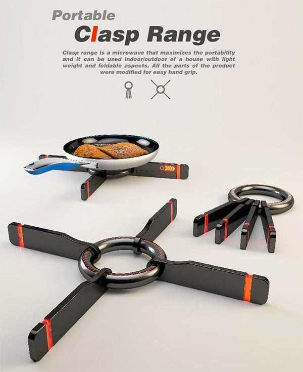
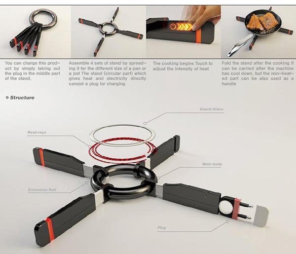
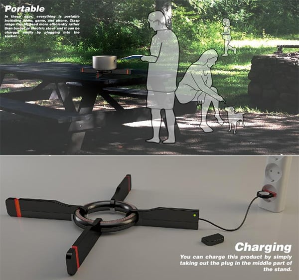
Clasp and Cook

In light of everything being portable, it’s only fair that cooking stoves go that way too. The Clasp Range is a portable stove that is lightweight, easy to charge and totally ready for the go. Think camping, picnics and BBQ Parties and more, designed to fit both indoors and outdoors, I love the handgrip and collapsible elements to the design.
Designers: Kinam Hwang, Mina Kim, Jisoo Koh & Suim Chois

Read more at http://www.yankodesign.com/2015/02/27/clasp-and-cook/#ssAfZqlJpUPbSygH.99
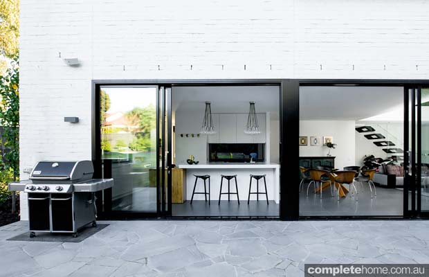
Melbourne Modern

With its nod to mid-century architecture and a dash of industrial style, this modern family home is a glass-fronted beauty
HOUSE Melbourne Modern
LOCATION Balwyn North, Vic
industrial_style_design
Back in 2004, Grand Designs UK featured a house called the Sugar Cube — a modernist structure with lots of glass and a stunning double-storey void area. The owners of this modern Melbourne home adored the UK project so, with the help of Canny Architecture, they drew on the Sugar Cube for inspiration for their own dream home.
Homeowners Kara and Lloyd have two young children and a pet cat and wanted a stylish house that was open plan and child-friendly without compromising on design. “We wanted the house to reflect us and the way we live,” says the couple.
geometric_modern_design
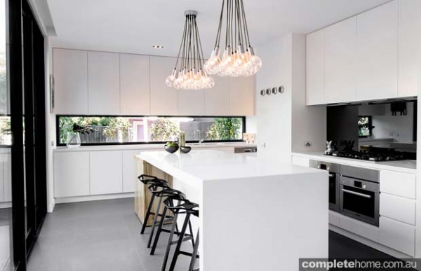
Set on a gently sloping rectangular block, the home is designed to capture the morning sunlight but protect against the hot westerly afternoon sun. The open-plan living and kitchen area is downstairs, connecting spectacularly to the outdoors with the double-storey glass wall and screen. The house has three bedrooms and three bathrooms, along with a study, large garage, gym and kids’ “snug”.
Lloyd’s love of warehouse conversions and Kara’s appreciation of mid-century architecture are alluded to throughout the house and there are plenty of industrial finishes such as steel and dark tiles. A bold monochromatic palette accentuates the modern and industrial feel further and was intentionally chosen to act as a blank canvas for changing colours and tastes in furniture and furnishings. Darker shades used in the floors and ceiling produce a moody atmosphere and accentuate the white tones in the home, creating contrast.
 http://www.completehome.com.au/articles/grand-designs-australia-melbourne-modern/50431.html?utm_source=Melbourne+Living&utm_campaign=2201ad9b6d-MelbourneLiving_090315&utm_medium=email&utm_term=0_a3faa279ae-2201ad9b6d-368314909
things we like
 
Wall&decò S.r.l.
With 2015 collections Wall&decò has once again ventured into unchartered territory by partnering with different artists and designers, able to produce a diverse mix of creations: from charcoal drawing to wall painting, from fabric printing to photographic images, from 3d graphics to engraving: all these artistic designs are cleverly turned into a vertical wall pattern, with truly original visual effects.
http://www.archiproducts.com/newsletter/dossier/240428
<br /><br /><br /><br />  The architects stuck to a gray-scale color palette, installing slate tile floors that softly contrast with the white walls and Eames dining chairs. “It lets the views out the windows become the focus,” Dworkind explains. Doses of pure black accent important features, like the central wall that divides the kitchen and master bedroom behind it from the main living space.  Photo by Adrien Williams.<br /><br /><br /><br />
http://www.dwell.com/houses-we-love/article/amazing-cantilevered-home-mountains#6
 
http://www.styleathome.com/kitchen-and-bath/trends/kitchen-trends-2010/a/28771/9
 

Sunday, April 5, 2015

Kitchen Design Academy-News Gazette # 69


Gazette-front-page1

Design is not Art.

Art is about personal expression. It is about the life, the emotions, the thoughts and ideas of the artist. It matters very little what observers do, their activity is not required, only their appreciation. The practice of Art doesn’t require them. It is a necessary activity for the artist, and the artist alone.
Design, on the other hand, is about use. The designer needs someone touse (not only appreciate) what they create. Design doesn’t serve its purpose without people to use it. Design helps solve human problems. The highest accolade we can bestow on a design is not that it is beautiful, as we do in Art, but that it is well-used.
Unlike Art, Design is always contextual. It matters when a design was created because of the context of its use: what problem is it supposed to solve? And for whom? At what point in time? This is why design is so related to technology, because technology changes so quickly, so must our designs. A design that worked ten years ago might not even be worth considering today. History is littered with wonderful designs that are no longer necessary.
 http://bokardo.com/archives/five-principles-to-design-by/
 

Willi Bruckbauer

I come from a carpenter dynasty, six, seven generations old. My father was a carpenter today. For me it was logical that I'm also learning a carpenter after secondary school. I have also worked for a few years as a carpenter and made perfect.
 

STEEL GIRDER KITCHEN

Steel kitchen, design by Willi Bruckbauer (2013) for Werkhaus
This designer kitchen impressively shows how successfully a kitchen living environment can be distinctively styled. It is based on a massive steel girder. With its electronically-controlled “Touch & Drive” extensions made of brushed stainless steel, plus two BORA Professional cooktops and an integrated vapor extractor, this kitchen offers far more than just striking looks. The combination of unique design and top-quality functionality provides a continual source of inspiration for new cooking adventures.
Steel kitchen STEEL GIRDER KITCHEN - WERKHAUS

ISLAND UNITS

Oak and stainless steel kitchen, design by Willi Bruckbauer (2010) for Werkhaus
This designer kitchen forms a single harmonious space with the adjoining room, showcasing a concept that goes far beyond the norm. Beautifully coordinated, the entire area gives the impression of having been carved from a single piece of material. The stainless steel cooking islands, featuring solid oak front panels, blend in attractively with the floor and the oak alcove, which creates the perfect frame for the tall white cupboards. It's a living room, dining room and kitchen all in one – and all exuding an atmosphere of warmth and comfort. In fact, calling it simply a kitchen hardly does it justice.
http://www.archiproducts.com/en/products/131960/oak-and-stainless-steel-kitchen-island-units-werkhaus.html
 
Home

Italy

Started up as a handicraft laboratory in 1939, in the sixties Salvarani launched the product which was to give its brand an international fame: the modular kitchen.
From 1959 onwards, Salvarani’s production range started to include kitchen with a plastic covering that could be bent thanks to an exclusive process. In few years Salvarani became the absolute leader on the marker, exporting a large part of its products. The company definitely established its international reputation with the display of the “Long Line” kitchen at the Museum of Modern Art in New York.
n the early seventies Salvarani developed a totally new material that the company has been producing with exclusive licence ever since: the Firon worktop. Each Salvarani kitchen is based on this indestructible surface, produced as a single block up to 6 m long.
Since 1996 Salvarani has been part of the FEG Group, active on the Italian furniture marker for over fifty years. Today Salvarani takes up a covered surface of 20.000 square metres in the Giussano plant and can rely on the productive synergy of two large companies: Salvarani’s technology in the production of laminate and Feg’s experience in the processing of wood.
During the 2014, TERRAGNI FABBRICAMOBILI announces the takeover of the company.

Collections

Highteak

Longline

Slim

Sunday

http://www.salvaranicucine.it/en

7 Reasons to Get Back into the Kitchen and Cook!

Just like me, you have been hibernating all this winter long, dreading to do the dishes and at the most making some hot cocoa. Well, time to pull up the socks and greet Spring, and bring home the freshness from the woods. Jamie Oliver, Gordon Ramsey and Nigella … move aside, because I give my folks these inspiring implements that can make your innovative recipes a charm! Let’s get back into the kitchen folks!
The first step to cooking is the cleaning; the Anton Strainer Bowl fits in here. It keeps the contents submerged in running water for a while and helps clean away the pesticide. On the flip side, I think it works swell as a pasta strainer; definitely making life a lot easier!
 
The Curling Pan is for all my lazy friends who hate doing the dishes, this chopping board doubles up as a frying pan! What this means is one less dish to clean … Super!
One of the basic and most important tools of the kitchen is the knife. Not many go splurging on it, but trust me a good, sharp knife helps get your work done faster and more efficiently than blunt one. The WMF Kitchen Knife Concept is crafted from a single piece of metal and promises to cut well.
I still remember my baking class teacher drilling into our head the importance of measuring the ingredients right. Apparently, a simple mistake can cost you a soft, fluffy cake. The Polygons Measuring Spoon is innovative and eliminates the need for multiple measuring units, thus saving space and time. Its super easy to use and very handy.
One of the most challenging tasks while baking is to separate the eggs. The YolkFish is by far, the most fun and functional way to separate your yolks and egg whites. One big gulp by the fish and you are set!
If you are a singleton, then nothing more important than a minimal cook-top, the lesser to work with, the lesser area to clean! The S.I.A.M. fits perfectly into the kitchen and features a built-in hood and induction cooker.
Washed cutlery needs a place to go into, and trust me wiping them dry is a PAIN! The Jumbo is perhaps the cutest way to dry them! This sink-side elephant takes the irritation out of waiting for wet dishes to dry and collects the runoff water while redirecting it back into the sink.
Read more at http://www.yankodesign.com/2015/03/05/7-reasons-to-get-back-into-the-kitchen-and-cook/#bKiIYgG8EtvLacFh.99

Shake it up: Traditional elements in a modern setting

Designer: Peter Lague for Innovative Kitchens

SHOP THE LOOK

Cabinet doors & panels Shaker-style two-pack satin in Solver Coffee Tort and Dulux Metalise
Internal hardware Hettich InnoTech runners, chrome baskets in pantry
Splashback Tiles
Benchtop essastone Bone White and American oak
Harmoniously mixing old with new isn’t always easy, but using an inside-out approach — where the internal hardware, materials and appliances are as modern as possible, encased in a more provincial exterior or finish — the brief was successfully fulfilled
“The client wanted a kitchen that was sleek and modern, yet warm and inviting at the same time.  A perfect example of this strategy is the treatment of the rangehood, where a state-of-the-art ventilation system is cloaked within a distinctly classical case, featuring long elegant lines, finished with mouldings at the base for added detail and architectural interest. The fixture is given pride of place as a dazzling white focal point against the rich dark-blue walls either side. The cabinets and panels, though made of modern materials, are also given the same treatment by incorporating an American Shaker-style finish — simple yet effective in conveying a certain old-world charm.
The look is completed with the inclusion of beautifully rustic reclaimed timber beams and suspended light case, which mirrors the thick, bevelled island benchtop in oak. In terms of colour, I left the palette minimal, using neutral tones as the dominant scheme in line with the polished concrete floor. The deep-blue colour matches the window and door frames, and highlights features such as the rangehood and floating island bench.”
See more at: http://www.completehome.com.au/project/shake-it-up-traditional-elements-in-a-modern-setting/50852.html#sthash.HHUpK2FE.dpuf
things we like

emmanuel babled fuses hand-blown glass and carrara marble with osmosi line

emmanuel babled fuses hand-blown glass and carrara marble with osmosi line
after more than 20 years experience in glass-blowing, italian designer emmanuel babled, realizes the ‘osmosi’ collection. the limited-edition line of furniture and vases connect noble materials from two regions of italy: glass produced by the venini in murano, and carrara marble by testi fratelli in verona. the artisanal products combine new technologies with traditional craftsmanship in a virtual fusion between marble and hand-blown glass thanks to surgically precise digital technology.
when a piece of glass is finished by craftsmen, a 3D scan transfers data to a CNC router, which cuts the marble. the two pieces match virtually perfectly, resulting in a symbiotic relationship between the materials. although in reality the two mediums remain separate, one is nothing without the other. the factor of natural unpredictability in glass makes each piece unique.
after visiting venice, milan, and dubai the ‘osmosi’ collection travels to france. the pieces will be displayed among other products by babled including quark tables, digit lights, and possibly the etna line of tables, which are still in production. the exhibition takes place at galerie yves gastou in paris, france march 12th to april 18th 2015.
http://www.designboom.com/design/focus-osmosi-emmanuel-babled-02-26-2015/
https://www.facebook.com/freshome/photos/a.178707196233.126108.171803576233/10152764311596234/?type=1&theater
 
https://www.facebook.com/freshome/photos/a.178707196233.126108.171803576233/10152764311596234/?type=1&theater