
"There is much talk about qualifying potential customers. When you qualify potential customers, you are determining if they are in their buying cycle and ready to buy from you. Is the customer ready to buy or just getting ready to buy? Those people who are ready to buy will put their money down today and make a purchase. Those who are getting ready to buy will likely not to buy from you right now no matter what you say or do. You want to be delivering the right messages depending on whether your potential customers are ready to buy or just getting ready. How do you determine this? If they tell you they are planning to buy, simply and politely ask them when they will be making this purchase. ‘Shall I give you a call in x weeks and meet again with a contract?’ You can ask. Their answer will tell you where they are at in their buying process."
Excerpt from "Module 6-Designer Job"
To find out more enroll now: http://www.kitchendesignacademyonline.net/contact/

Matteo Beraldi
Matteo Beraldi was born in Meda in 1983, he graduated in 2007 in product design at the Milan Politecnico Design school. From 2007 to 2010 he has been working with differents design studios for various companies like Camparisoda,Chopard, Danese, Lavazza, Lorenz, Moleskine, Triennale di Milano, and took partas product manager for TobeUs, a new brand of wooden toys environmentally friendly and entirely made in Italy. Since 2010 he opened his own design studio, where he works on everything that gets infected by creativity. Among his clients: Anvivi, Febal, Jannelli & Volpi, Lago, Mapei, Museo Poldi Pezzoli, Publisearch.
Alicante kitchen for Febal cucine


Alicante kitchen for Febal cucine is born from a simple but strong idea, want to create a kitchen really dynamic and in constant movement,that is to contrast with the current canonical models, statics and monolithics, trying to meet always practicality and ergonomics requirements. A groundbreaking project, enhanced by individually-designed supports allowing the latest technological devices to be used in the kitchen.
Source http://www.matteoberaldi.it/alicante-2/
Drawing prestige from a name based on quality, Febal Casa now offers a new retail concept that has led the brand, a part of the Colombini Group since 2009 and leader in fitted kitchens for more than half a century, to develop complete furnishing programmes for the whole home.
No longer just kitchens, produced with major input from top names in Italian design and architecture, but living and bedroom solutions too. Innovation, continual investments and control of the entire production chain are the brand’s keywords.
Febal Casa: a furnishing solution for bringing the consistency of style and quality typical of genuine Italian products to the whole home, with a high service content, meaning the perfect combination of expertise, modernity and customisation.
The 10 collections and over 20 new product launches every year also guarantee the constant offering of up-to-date products and services to meet the demands of today’s cosmopolitan consumers.
Ice, Industrial edition.
With a blend of technology and tradition, the mood becomes carefree and relaxed. Around the large table, it becomes a pleasure to entertain friends once more:it takes the drudgery out of cooking.


Primavera colors
Domestic life for the rebellious, bold and passionate spirit is about choosing a style that stands out from the crowd with distinctive elegance. Colors stands for fun, creativity and combining imagination and colour harmoniously; it is the curiosity driving you to discover contrasting new compositions with bold personalities.


chantal
The kitchen has become more and more an environment where we combine modern and sophisticated habits with spontaneity and simplicity. In this new concept of space, Chantal proposes its own personal style to portray the kitchen’s various personalities: the horizontal and vertical scans make up composite solutions and very advanced design possibilities; material and colour emphasize shapes and make up volumes, in a increasing individual look for people with strong individuality.


Romantica
ROMANTICA offers a sophisticated, classic style that caters perfectly for the functional and technological requisites of the modern lifestyle. Linear and sober, crosses the boundary between tradition and the contemporary with door mouldings and decorative details evocative of an elegant and perfectly balanced neoclassical style.


Romantica decor
The return of the aristocratic era. The tastes and almost sumptuous elegance of bygone days reborn in a touch or gold and silver in decisive intense colouring. Open spaces. Extreme comfort. Romantica Décor represents the refined evolution of Romantica Febal, from which it retains its classical qualities and its reborn neoclassicism and linearity in the large door mouldings. This time, however, the styling makes use of silver and gold flake – the raw materials used to add that finishing touch to the prestigious furniture of bygone days – adding a vibrant sparkle to cornices and structural elements. The butter-white and black lacquered finishes combine tastefully with the silver and gold of the cornices. The door and drawer knobs retain their silver/gold and satin or gloss steel finishes.


Source: http:/en.febalcasa.com/
Funky Flexible Faucet
Add a touch of color and flexible fun to you kitchen space with the COOK tap! The classical sense of the kitchen spring faucet is reworked into a brightly colored, flexible, soft, silicon hose that can be twisted and turned 360° with ease. When finished using, just let go and it will automatically reposition thanks to its embedded magnets. For a fresh and modern look, it comes in five customizable color variants: sunflower gray, red chili, green sage, milky white and blue blueberry.
Designer: Sovrappensiero Design Studio
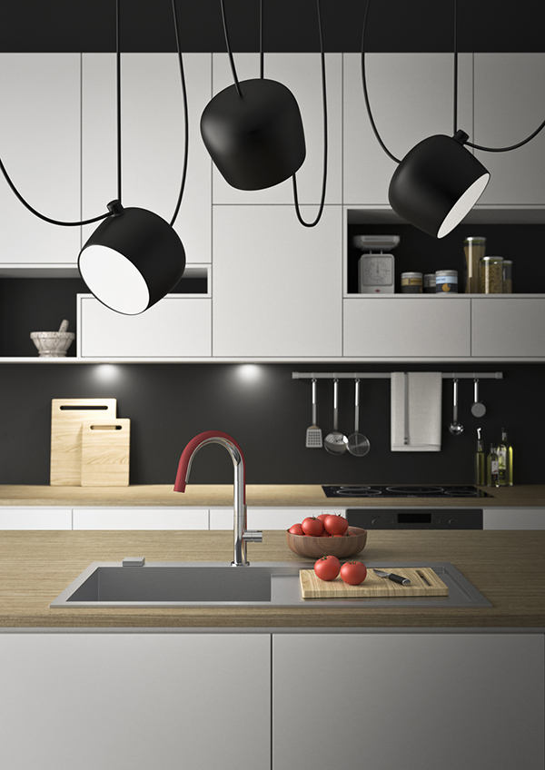


Source: http://www.yankodesign.com/2014/04/17/funky-flexible-faucet/#S8kaqw5xWmj6IEl5.99

Black and tan – glossy entertainers kitchen from Kitchen & Bathroom Trends volume 3002
Credit List
Interior designer and kitchen designer: Jasmine McClelland HIA, KBDI, BDAV, AEDA, Jasmine McClelland Design (Burnley, Vic)
Kitchen manufacturer : Sunset Kitchens
With benchtops and cabinets creating the lion's share of the impact in a kitchen, it's worth taking your time and making material choices carefully. For example, just as a sparkling black cocktail dress instantly conjures up evening glamour, so will glossy black cabinetry.

As the owners of this kitchen have four children and an energetic social life, they asked designer Jasmine McClelland to create a seamless blend of family functionality and entertainment chic.


The kitchen successfully meets both these needs through careful space planning, the choice of finishes, and attention to day-to-day functionality.
"In a sense, this kitchen hides in plain sight," says McClelland. "To downplay the functional aspects in visual terms, we created three main divisions and elements. The central, self-contained bar area, set into the wall, is ideally situated for parties. It is close to the island, which can act as a serving counter, and is only a couple of steps from the dining table.

"The large island looks much like a piece of furniture or a sculpture in its own right, and the perimeter workspace that runs along in front of the window resembles a deep window sill. This benchtop retreats into a passageway that leads to the laundry and the back door. Most of the storage and appliances are integrated into this area, out of sight of the open living spaces."
The kitchen's dual roles are reflected in the materials as well. Warm caramel-coloured True-Grain Veneer on the cabinet fronts contrasts with the sleek sheen of the Quantum Quartz in Gobi Black on the island and bar area. The niche below the cantilevered benchtop is in the same veneer as the perimeter cabinets, and the dark stone is complemented by black blinds and pendant light fittings. This black and tan palette continues throughout the home, including the entry foyer behind a glass wall and in the cabinetry upstairs.
The three sections of the kitchen connect with each other visually in other ways, too.
"To create aesthetic balance, the custom rangehood extends the length of the benchtop beneath. Together with the suspended, cantilevered island bench, this creates a luminous and dynamic room," says McClelland.
And despite its size, the hood also plays something of a disappearing act in its own right. Its long, slender form is easy to overlook, and the reflective stainless steel picks up on its immediate surroundings.


To address the functional requirements, practical elements are set on or near the perimeter, and all cabinets feature Blum Servo-Drive hardware. The project won the Kitchen and Bathroom Designers Institute Large Kitchen of the Year Award for 2013.
Source article :http://trendsideas.com/Article17741/Australia/Kitchens
Source images:http://www.jasminemcclellanddesign.com.au/product/design/kitchens/mentone-house/

Here are some of the latest trends as presented in the HIA show :
1. Colour & Light: Understanding the Colour Rendering Index
If you have an investment property or your own home, the sensible way to add value to your property is through renovating for profit. Keeping up to date with trends and having a property that looks fresh will appeal to prospective buyers. Renovating will add value and generate a profit, if you stick to your plan and your budget.
Understanding the principles behind colour and light is central to grasping the relevance of CRI values. We’ve pulled apart the key theories at play that ultimately impact upon lighting choices.
Light wavelengths & the human eye
The human eye is made up of rods and cones – two very sensitive receptors that detect light intensity and colour. When different wavelengths of light enter the eye, they create the sensation of different colours. The average eye can perceive light wavelengths ranging from 400 – 750 nanometres and is so sensitive that it can differentiate between around 7 million colours.
The human eye is made up of rods and cones – two very sensitive receptors that detect light intensity and colour. When different wavelengths of light enter the eye, they create the sensation of different colours. The average eye can perceive light wavelengths ranging from 400 – 750 nanometres and is so sensitive that it can differentiate between around 7 million colours.

White light is made up of coloured light wavelengths combined together in a phenomenon known as additive colour. A ‘perfect’ white light is made up of all of the wavelengths that span the visible spectrum. A common method of separating white light into its component colours is to pass it through a prism, causing it to diffract.
Defining CRI
The Colour Rendering Index is a method of measuring a light’s ability to illuminate different colours using a number from 0 – 100. There are 14 standard colours that are used when testing for CRI as shown in the diagram.
The Colour Rendering Index is a method of measuring a light’s ability to illuminate different colours using a number from 0 – 100. There are 14 standard colours that are used when testing for CRI as shown in the diagram.
A ‘perfect’ white light is made up of all possible wavelengths of visible light combined and is said to have 100CRI, whereas a light with 80CRI – the rating of most LEDs on the market – would be missing 20% of the light wavelengths that make up the visible spectrum.
How is colour generated?
Colour in interiors is most commonly generated by pigmented surfaces – whether these are painted walls, woven textiles or decorative objects. These surfaces create the sensation of colour by absorbing some wavelengths of light and reflecting others that then enter the eye. Because the reflection of light wavelengths is essential to generating the sensation of colour, the more wavelengths that make up a beam of white light, the better it will be at producing different hues.
Colour in interiors is most commonly generated by pigmented surfaces – whether these are painted walls, woven textiles or decorative objects. These surfaces create the sensation of colour by absorbing some wavelengths of light and reflecting others that then enter the eye. Because the reflection of light wavelengths is essential to generating the sensation of colour, the more wavelengths that make up a beam of white light, the better it will be at producing different hues.

Light sources that have a high CRI value will bring out the details and subtleties of any surface that they illuminate. This means that everything from skin tone to décor details will appear sharper and more vibrant. Light sources that have a low CRI value will make colours appear dull and not true to life. Depending on which area of the visible spectrum the white light is missing, colours will appear more blue, green or red than they should, and fine detailing such as the flecks in marble surfaces will be lost.
The photograph shows the difference between colour vibrancy under a light source with 70CRI and a light source with 95CRI. The low CRI light source is missing warm red and orange wavelengths, causing colours to appear dull and washed out.
Comparing CRI values - what to look for
It is important to note that the CRI values of one light can only be compared to another if the bulbs are of the same colour temperature – lights with different colour temperatures will fundamentally emit different wavelength variations. Similar to lumen output, lights that do not offer any information about CRI are to be avoided as this often indicates a low rating.
It is important to note that the CRI values of one light can only be compared to another if the bulbs are of the same colour temperature – lights with different colour temperatures will fundamentally emit different wavelength variations. Similar to lumen output, lights that do not offer any information about CRI are to be avoided as this often indicates a low rating.
When choosing LED lighting, look for as high a CRI value as possible to maximize colour, tone and detail. What’s a high enough CRI value? Aim for 95CRI lighting to illuminate near-perfect colour.

Credit:
Clare Acheson, Strategist, Brightgreen
This article was first published on the Brightgreen blog. Visit www.brightgreen.com for more information.
Clare Acheson, Strategist, Brightgreen
This article was first published on the Brightgreen blog. Visit www.brightgreen.com for more information.
Pantone Reveals Colour of the Year for 2014

Move over Emerald because there’s a new colour in vogue and this year we’ll be painting the town a bright, vibrant shade of purple. The Pantone Colour Institute, a global authority on all things colour, has selected Radiant Orchid as the 2014 Colour of the Year and almost instantly created headlines around the world with this bold selection. This crisp, clean shade of light purple which radiates joy was chosen to intrigue the eye and spark the imagination. While last year’s colour Emerald, symbolised growth, renewal and prosperity, 2014’s colour hops across the colour wheel to invite innovation and calmness.
According to Leatrice Eiseman, Executive Director of the Pantone Colour Institute, “Radiant Orchid inspires confidence and emanates great joy, love and health. The enchanting harmony of fuchsia, purple and pink undertones draws you in with its beguiling charm.” The purply rose is expected to influence the world of fashion and interior design in a big way this year as it “encourages expanded creativity and originality, which is increasingly valued in today’s society” says Eiseman.

But the questions remains – how can we inject this vibrant new colour into our homes, without it being over bearing and an inconvenience on the eye? Many experts subscribe to the view that this colour demands a bold approach to your home interior, either an all-in mentality or nothing at all. However, one can always have too much of a good thing and we believe that Radiant Orchid, a colour which really packs a punch, is best used when introduced to your home with some restraint.
If you are timid about working with Radiant Orchid or any bold colour, simply start small. Accessories and accents are an inexpensive way to embrace a new trend and an even easier way to incorporate a new colour palette. A vibrant pillow, a gorgeous print or lampshade in Radiant Orchid can go a long way to spicing up a living area that is looking a little tired.
For those who like to live on the wild side, a sure way to make a statement in your interior design is to pair this enchanting colour with neutrals such as white or beige – allowing the purple to really pop. Adding a decorative rug in an all-white living room would really enhance the rich colour tone of the rug, creating a bold and stunning feature for the room.
Pantone clearly loves the idea of using Radiant Orchid to “spruce up the interior of your home” and believes that the colour is as “adaptable as it is beautiful” as mentioned in their press release. It believes that this exotic tone “complements olive and deeper hunter greens, plus offers a gorgeous combination when paired with turquoise, teal and even light yellows.”
Having so many meanings, and the most romantic undertones of purple, pink and fuchsia, it’s difficult not to love this colour. It represents peace of mind, magic and mystery, as well as royalty. We are trusting of Pantone, the talented trendsetter, and will certainly be welcoming this rich and emotional colour into our homes – to what extent is up to you.
The latest in Lighting
From industrial chic to sumptuous chandeliers, the latest trends in lighting can be summed up with the words: "Whatever suits your fancy."
Even if energy conservation is your top priority, you can find the right lighting for every room of the house and even outdoors, without having to make energy compromises. Here are some of the latest trends in lighting we've been hearing about lately.

 Take a look at the kitchen photos on HI Pages and before you get past the first page, you'll see one current trend in kitchen lighting. For a long time, recessed ceiling lighting was not just a trend; it was almost obligatory in the kitchen. Whilst recessed lighting hasn't gone away, chandeliers and other hanging lighting above kitchen islands is a distinct trend today. Functional and stylish, having a low hanging light to illuminate your kitchen island is a trend that is likely to stay with us for a long time.
Cool burning, versatile and highly energy efficient, LED lighting is perfect in places in the kitchen where having sufficient light used to be a problem. The compact size and cool temperature of LED light makes it the right choice for your display cabinets or to illuminate areas under your overhead cabinets. Get your electrician to install these with separate dimmer switches and customise the look and feel of your kitchen simply by highlighting different features or dimming the lights to suit the occasion.
The latest thing in splashbacks is the LED glass splashback. If you haven't seen or heard of these before, check out our HI Pages article, What is an LED Splashback? and then head down to your nearest splashbacks showroom to see them for yourself.
 More than any other room in the house, the living room needs a variety of lighting options. For those times when you want the room uniformly illuminated, recessed lights are always great. Now that we have new lighting options like halogen, LED and compact fluorescent lights, we have even greater options in recessed living room lighting. The twinkling glow that comes from rows of compact recessed LED or halogen lights is one current trend.
In contrast to concealed ceiling lighting, trendsetters looking for the loft look are going retro with old-fashionedtrack lighting systems fitted with compact fluorescent lights. Unlike in the past, when track lighting was usually in a colour that matched the ceiling, matt black against a white ceiling is "tres chic" or for a little more subtley, you can choose grey or natural aluminium.
Other trends in living room lighting include:
Sculptural pendant lights in classic or ultra-modern designs.
Chandeliers are back in vogue, both in traditional settings and as a strikingly bold statement in an otherwise minimalist interior.
Sculptural pendant lights in classic or ultra-modern designs.
Chandeliers are back in vogue, both in traditional settings and as a strikingly bold statement in an otherwise minimalist interior.
The loft look is represented in floor lamps on stainless steel tripod stands and table lamps with articulated arms reminiscent of office desk lamps of the sixties and seventies.
 Thanks to LED lights, long-lasting batteries and cleverly designed solar-recharging lights, the biggest trend in outdoor lighting is the garden light. Garden lights can be installed anywhere without the necessity of wiring. Since they can be installed anywhere, they are installed anywhere they can illuminate a path, highlight a garden feature or create ambiance outdoors.
There are so many ways to use outdoor lighting today, it has led to the establishment of a new profession. Just as a kitchen companies havekitchen designers on their staffs, many lighting suppliers now employ outdoor lighting designers to help their customers create just the right look.
For some bright lighting ideas, contact a lighting design consultant in your area. They know all the products and all the latest trends in lighting. With their help, you can light up your life with a coordinated, energy efficient lighting solution for your home.
Source: http://www.hiahomeshow.com.au/trends.php
Yes?

Source:http://www.archiproducts.com/en/products/129066/eternity-classic-style-kitchen-laguna-cadore-arredamenti.html
No?

Source:http://www.archiproducts.com/en/products/131962/oak-and-concrete-kitchen-tree-trunk-kitchen-werkhaus.html
wow, it is really such a great thing about Kitchen Design, thanks for sharing such a brilliant information and post. I just love the designs and its concept. Awesome.. Thumbs up from me.
ReplyDeletebathroom renovations